UI/UX RESEARCH & DESIGN
Improving New User Experience
for Product Addition in POS
Improving New User Experience for Product Addition in POS
ROLE
ROLE
End to end Research & Design
End to end Research & Design
End to end Research & Design
SCOPE
SCOPE
2 Weeks
2 Weeks
2 Weeks
YEAR
YEAR
2024
2024
2024
TOOLS
TOOLS
Figma
Figma
Figma
Project Intro
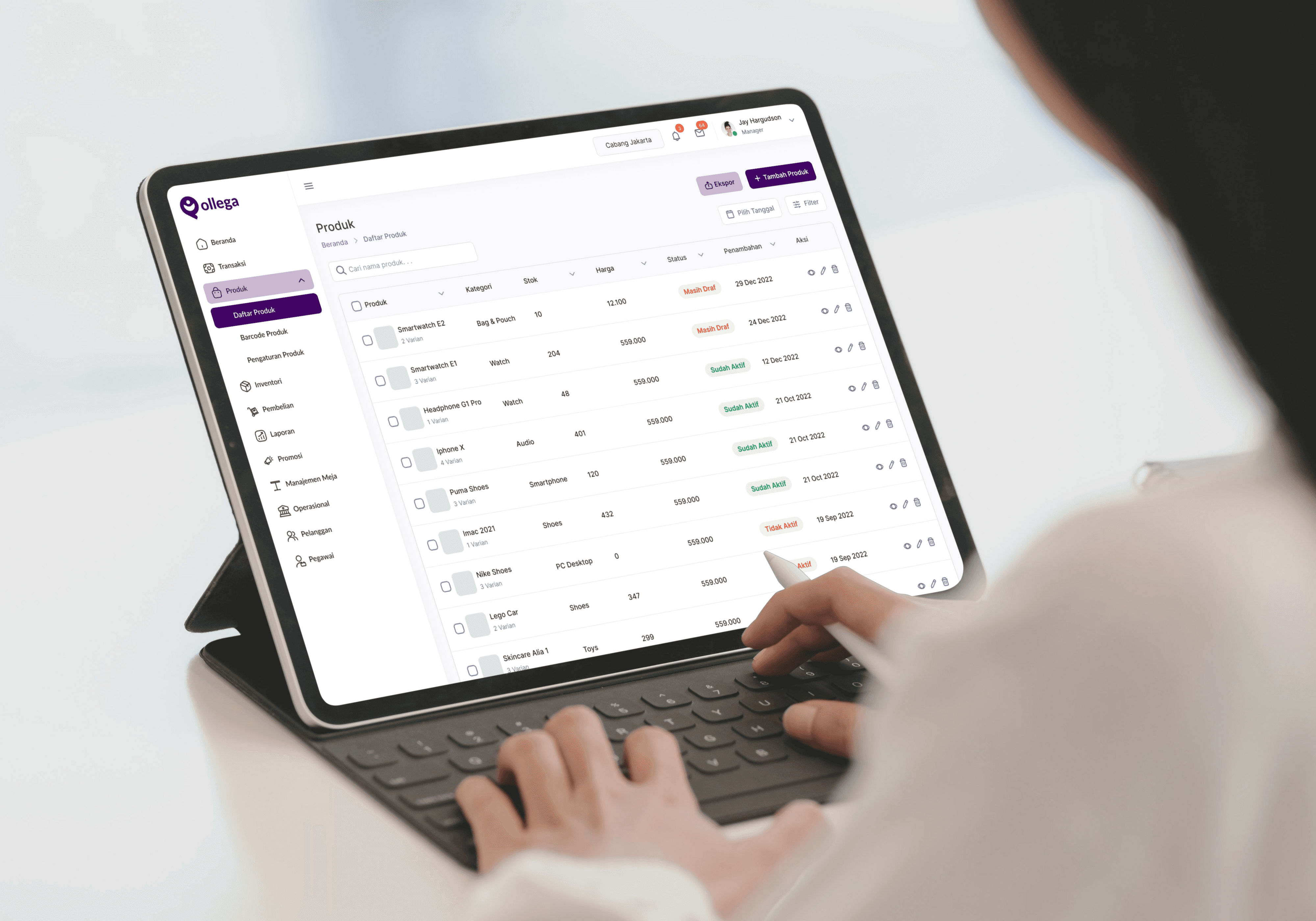
An intuitive system that enables business owners to effortlessly conduct digital transactions with customers while automatically generating detailed sales reports and real-time statistics.
An intuitive system that enables business owners to effortlessly conduct digital transactions with customers while automatically generating detailed sales reports and real-time statistics.
Problem Discovery
Problem Discovery
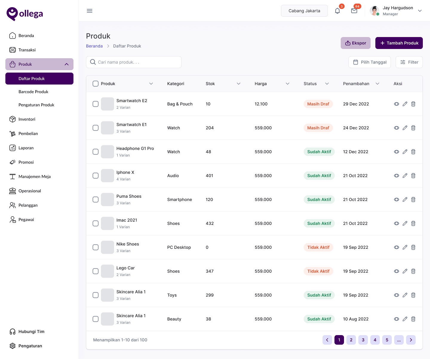
Most new users struggle to initiate transactions at the POS, often feeling confused when adding the products they want to sell.
Most new users struggle to initiate transactions at the POS, often feeling confused when adding the products they want to sell.
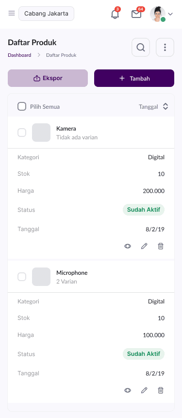
Based on our interviews with new and existing users, many find it confusing and difficult to add products to sell on the POS. This is because there are too many fields to fill out, and the labels for the input columns are not clear enough. As a result, users often make mistakes and take a long time to figure out the product addition process. Additionally, most users only have a cellphone and rarely use a laptop, so the desktop version is hard to use on mobile devices.
Based on our interviews with new and existing users, many find it confusing and difficult to add products to sell on the POS. This is because there are too many fields to fill out, and the labels for the input columns are not clear enough. As a result, users often make mistakes and take a long time to figure out the product addition process. Additionally, most users only have a cellphone and rarely use a laptop, so the desktop version is hard to use on mobile devices.
How might we help new users add products more quickly, effectively, and easily?
How might we help new users add products more quickly, effectively, and easily?
Our Solution
Our Solution
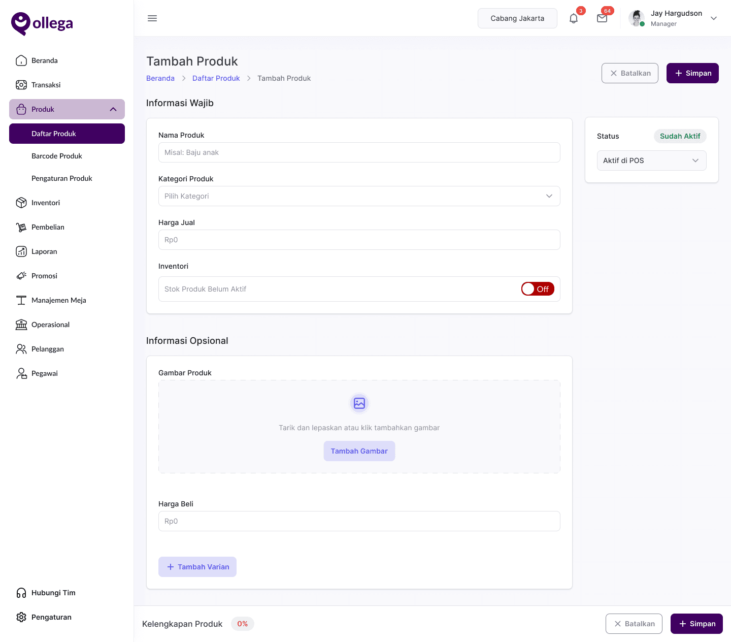
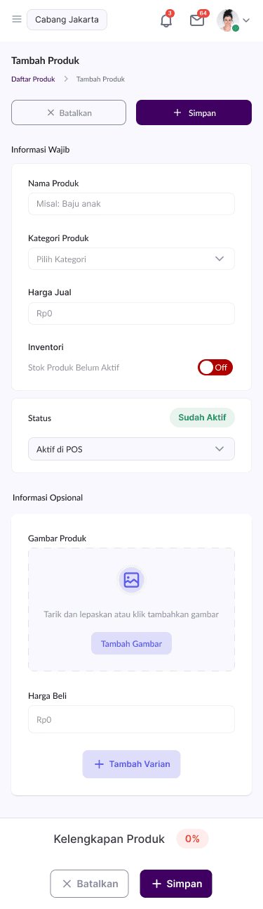
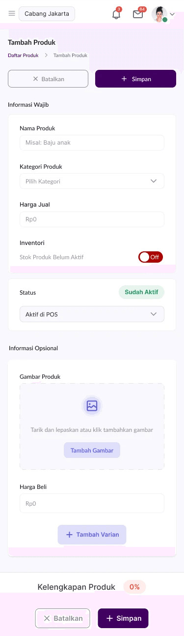
Grouping the information that users need to fill in and creating a responsive website that is accessible on mobile devices.
Grouping the information that users need to fill in and creating a responsive website that is accessible on mobile devices.
Create an easier flow for adding products, allowing users to stay on the add product page without needing to search or navigate to other menus or features, while ensuring responsiveness on mobile devices.
Create an easier flow for adding products, allowing users to stay on the add product page without needing to search or navigate to other menus or features, while ensuring responsiveness on mobile devices.
Before Redesign
Smooth Transactions,
Happy Interactions.
Smooth Transactions,
Happy Interactions.
Smooth Transactions,
Happy Interactions.

After Redesign
After Redesign Improvement
UI & Navigation Simplification
UI & Navigation Simplification
💠
Before:
The less intuitive interface made it difficult for users to find important features.
Before:
The less intuitive interface made it difficult for users to find important features.
💠
After Redesign:
The navigation structure was improved with clearer icons, more organized categories, and a simpler transaction flow to improve usability.
After Redesign:
The navigation structure was improved with clearer icons, more organized categories, and a simpler transaction flow to improve usability.
Transaction Process Optimization
Transaction Process Optimization
💠
Before:
There were many steps to go through when placing an order and completing the payment.
Before:
There were many steps to go through when placing an order and completing the payment.
💠
After Redesign:
Reduced the number of clicks required, added a quick checkout feature and more organized product categories, speeding up the transaction process by up to 30%.
After Redesign:
Reduced the number of clicks required, added a quick checkout feature and more organized product categories, speeding up the transaction process by up to 30%.
Visual Improvements and Information Hierarchy
Visual Improvements and Information Hierarchy
💠
Before:
The display was too dense and difficult for users to read.
Before:
The display was too dense and difficult for users to read.
💠
After Redesign:
Cleaner design, better color contrast, and more legible typography to improve accessibility and ease of use.
After Redesign:
Cleaner design, better color contrast, and more legible typography to improve accessibility and ease of use.
Responsiveness & Accessibility
Responsiveness & Accessibility
💠
Before:
Not optimal across screen sizes and difficult to use on mobile devices.
Before:
Not optimal across screen sizes and difficult to use on mobile devices.
💠
After Redesign:
More responsive and optimized across screen sizes, making it flexible to use on tablets and smartphones.
After Redesign:
More responsive and optimized across screen sizes, making it flexible to use on tablets and smartphones.
Impact Metrics
📈 48% Increase in Successful Product Additions
More users were able to add products to the POS without issues.
📈 48% Increase in Successful Product Additions
More users were able to add products to the POS without issues.
📉 15% Reduction in Input Errors
Clearer labels and form validation minimized mistakes.
📉 15% Reduction in Input Errors
Clearer labels and form validation minimized mistakes.
⏱️ 9.5 Minutes Faster Product Addition
Users spent significantly less time completing the process.
⏱️ 9.5 Minutes Faster Product Addition
Users spent significantly less time completing the process.
🔄 10% Improvement in First-Attempt Product Retention
More users successfully added products without needing corrections.
🔄 10% Improvement in First-Attempt Product Retention
More users successfully added products without needing corrections.
The Process
The Process
When we observed Qollega POS users, we found that the system was slowing them down rather than helping them. Complicated processes, confusing labels, and a less than mobile-friendly interface frustrated many users. So we started asking: What if Qollega POS could be more intuitive and efficient? With that question, we began our redesign journey.
When we observed Qollega POS users, we found that the system was slowing them down rather than helping them. Complicated processes, confusing labels, and a less than mobile-friendly interface frustrated many users. So we started asking: What if Qollega POS could be more intuitive and efficient? With that question, we began our redesign journey.
About Qollega POS
About Qollega POS
Qollega POS is a Point of Sales system that helps MSMEs manage transactions, stock, and sales reports digitally. As an important tool for business owners, this platform must be easy to use and allow users to add products to the system quickly and efficiently. However, from the research results, it was found that this feature has several challenges that hinder user efficiency.
Qollega POS is a Point of Sales system that helps MSMEs manage transactions, stock, and sales reports digitally. As an important tool for business owners, this platform must be easy to use and allow users to add products to the system quickly and efficiently. However, from the research results, it was found that this feature has several challenges that hinder user efficiency.

Problem Identification
During the observation and interview sessions with 12 MSME users who use Qollega POS, several main problems were found:
During the observation and interview sessions with 12 MSME users who use Qollega POS, several main problems were found:
❌ Process is too complex
❌ Process is too complex
⚠️Users experience difficulty adding products because they must fill in too many mandatory fields, as a result the process feels slow and frustrating, so I propose simplifying input forms with autofill and recommendation options.
⚠️Users experience difficulty adding products because they must fill in too many mandatory fields, as a result the process feels slow and frustrating, so I propose simplifying input forms with autofill and recommendation options.
⚠️Users struggle because rarely used fields such as SKU and long descriptions are still required, as a result the process feels irrelevant for small SMEs, so I propose using default values for fields that often have similar values.
⚠️Users struggle because rarely used fields such as SKU and long descriptions are still required, as a result the process feels irrelevant for small SMEs, so I propose using default values for fields that often have similar values.
⚠️Users face inefficiency because there is no auto suggestion or template support, as a result they must type everything manually, so I propose separating required and optional fields to let users add products faster.
⚠️Users face inefficiency because there is no auto suggestion or template support, as a result they must type everything manually, so I propose separating required and optional fields to let users add products faster.
❌ Labels & categories are confusing
❌ Labels & categories are confusing
⚠️
Users struggle to group their products because the system’s categories are not flexible and do not fit various business types, as a result filtering and reporting become inaccurate, so I propose providing dynamic categories with automatic recommendations.
Users struggle to group their products because the system’s categories are not flexible and do not fit various business types, as a result filtering and reporting become inaccurate, so I propose providing dynamic categories with automatic recommendations.
⚠️
Users get confused when classifying products because the category labels are not intuitive, as a result they often select the wrong category, so I propose adding clear descriptions for each category.
Users get confused when classifying products because the category labels are not intuitive, as a result they often select the wrong category, so I propose adding clear descriptions for each category.
⚠️
Users cannot easily find the right category because there is no recommendation feature based on the product entered, as a result the search process becomes more difficult, so I propose including product examples in each category to guide selection.
Users cannot easily find the right category because there is no recommendation feature based on the product entered, as a result the search process becomes more difficult, so I propose including product examples in each category to guide selection.
❌ Not mobile-friendly
❌ Not mobile-friendly
⚠️
Users struggle to operate the POS because the interface is optimized for desktop, as a result mobile transactions take much longer, so I propose redesigning the UI with a mobile-first approach.
Users struggle to operate the POS because the interface is optimized for desktop, as a result mobile transactions take much longer, so I propose redesigning the UI with a mobile-first approach.
⚠️
Users find it hard to tap buttons because the UI on mobile is not fully responsive, as a result small elements reduce efficiency, so I propose adjusting button size, font, and layout for small screens.
Users find it hard to tap buttons because the UI on mobile is not fully responsive, as a result small elements reduce efficiency, so I propose adjusting button size, font, and layout for small screens.
⚠️
Users waste time scrolling because key features like transaction history are buried deep, as a result they feel the app is inconvenient, so I propose adding a “Quick Access” feature for shortcuts.
Users waste time scrolling because key features like transaction history are buried deep, as a result they feel the app is inconvenient, so I propose adding a “Quick Access” feature for shortcuts.
❌ Input errors are frequent
❌ Input errors are frequent
⚠️
Users often make mistakes when entering prices because the data format is unclear, as a result they must re-enter values repeatedly, so I propose showing proper formatting examples in each input field.
Users often make mistakes when entering prices because the data format is unclear, as a result they must re-enter values repeatedly, so I propose showing proper formatting examples in each input field.
⚠️
Users cannot detect wrong inputs because there is no real-time validation, as a result stock or price errors occur, so I propose providing real-time validation for correct input format.
Users cannot detect wrong inputs because there is no real-time validation, as a result stock or price errors occur, so I propose providing real-time validation for correct input format.
⚠️
Users get frustrated when fixing mistakes because there is no undo or quick edit option, as a result they waste time redoing the entire input, so I propose adding a “Quick Edit” feature to correct errors efficiently.
Users get frustrated when fixing mistakes because there is no undo or quick edit option, as a result they waste time redoing the entire input, so I propose adding a “Quick Edit” feature to correct errors efficiently.
Goal Redesign
During the observation and interview sessions with 12 MSME users who use Qollega POS, several main problems were found:
During the observation and interview sessions with 12 MSME users who use Qollega POS, several main problems were found:
🎯 Simplify the product add process to make it faster & more intuitive.
🎯 Ensure designs are more responsive and mobile-friendly.
🎯 Reduce input errors through clearer designs.
🎯
Simplify the product add process to make it faster & more intuitive.
🎯
Ensure designs are more responsive and mobile-friendly.
🎯
Reduce input errors through clearer designs.
User Research
User Research
🔎 User Interview (12 MSME users)
🔎 User Interview (12 MSME users)
👥 7 out of 12 users complained about the many columns that had to be filled in.
👥 9 out of 12 users were confused by the terms in the product category.
👥 8 out of 12 users said they used mobile phones more often than laptops.
👥
7 out of 12 users complained about the many columns that had to be filled in.
👥
9 out of 12 users were confused by the terms in the product category.
👥
8 out of 12 users said they used mobile phones more often than laptops.
🏬 Competitor Analysis
🏬 Competitor Analysis
⚡Moka → Has a simpler product add-on process with a step-by-step wizard.
⚡Olsera → More intuitive UI with auto-suggestion for product categories.
⚡
Moka → Has a simpler product add-on process with a step-by-step wizard.
⚡
Olsera → More intuitive UI with auto-suggestion for product categories.
🔑 Key Insight
🔑 Key Insight
📌 Users prefer a "step-by-step" approach over long forms.
📌 Product categorization is better if made auto-suggestion.
📌 Price and stock input should be clearer with format validation.
📌
Users prefer a "step-by-step" approach over long forms.
📌
Product categorization is better if made auto-suggestion.
📌
Price and stock input should be clearer with format validation.
Understanding the Problem,
Delivering the Solution
Understanding the Problem, Delivering the Solution
We begin by identifying the core challenges users face, then craft solutions that directly address their needs, ensuring every feature we build has a meaningful impact.
We begin by identifying the core challenges users face, then craft solutions that directly address their needs, ensuring every feature we build has a meaningful impact.
Solutions
💡
Users felt overwhelmed by too many fields, so I grouped related inputs using progressive disclosure. This solution was chosen because it reduces cognitive load by only showing information when relevant, helping users stay focused and less stressed.
Users felt overwhelmed by too many fields, so I grouped related inputs using progressive disclosure. This solution was chosen because it reduces cognitive load by only showing information when relevant, helping users stay focused and less stressed.
💡
Users struggled with form complexity, so I simplified the product form by reducing mandatory fields. I applied this approach because not all fields are equally important at the first stage, by minimizing friction, users can complete tasks faster without losing essential data.
Users struggled with form complexity, so I simplified the product form by reducing mandatory fields. I applied this approach because not all fields are equally important at the first stage, by minimizing friction, users can complete tasks faster without losing essential data.
💡
Users often hesitated when filling out forms, so I added tooltips and default values for easier entry. This idea was chosen because contextual hints and pre-filled values act like invisible guidance, preventing errors before they even happen
Users often hesitated when filling out forms, so I added tooltips and default values for easier entry. This idea was chosen because contextual hints and pre-filled values act like invisible guidance, preventing errors before they even happen
💡
Users needed faster input and less confusion, so I included icons and descriptions for each category. I selected this because visual cues and microcopy reduce ambiguity, ensuring users immediately understand the purpose of each field without second-guessing.
Users needed faster input and less confusion, so I included icons and descriptions for each category. I selected this because visual cues and microcopy reduce ambiguity, ensuring users immediately understand the purpose of each field without second-guessing.
💡
Users frequently miscategorized products, so I reorganized the category structure with clearer naming. This solution was chosen because taxonomy clarity directly impacts usability; when naming aligns with user mental models, errors naturally decrease.
Users frequently miscategorized products, so I reorganized the category structure with clearer naming. This solution was chosen because taxonomy clarity directly impacts usability; when naming aligns with user mental models, errors naturally decrease.
💡
Users had difficulty finding the right category, so I implemented auto-suggestions based on product type. I designed this solution because predictive assistance not only saves time but also builds user confidence by offering intelligent guidance.
Users had difficulty finding the right category, so I implemented auto-suggestions based on product type. I designed this solution because predictive assistance not only saves time but also builds user confidence by offering intelligent guidance.
💡
Users often got lost in the wrong category, so I reduced confusion and misclassification with a refined category system. This solution was chosen because error reduction is not only about fixing mistakes but also about proactively shaping the path so errors rarely occur.
Users often got lost in the wrong category, so I reduced confusion and misclassification with a refined category system. This solution was chosen because error reduction is not only about fixing mistakes but also about proactively shaping the path so errors rarely occur.
High Fidelity Design